floqast
accounting
meets ai
nailing the
narrative
FloQast automates common accounting workflows helping to streamline and make them more efficient. Whether automating reconciliations, documentation requests or other workflows such as the month-end Close, financial reporting or payroll, FloQast’s easy-to-use and quick-to-deploy solutions enhance the way accounting teams work so they can work smarter, not harder.
simplified message
Floqast’s AI automations are here to make your job easier, not obselete.
product
visualization
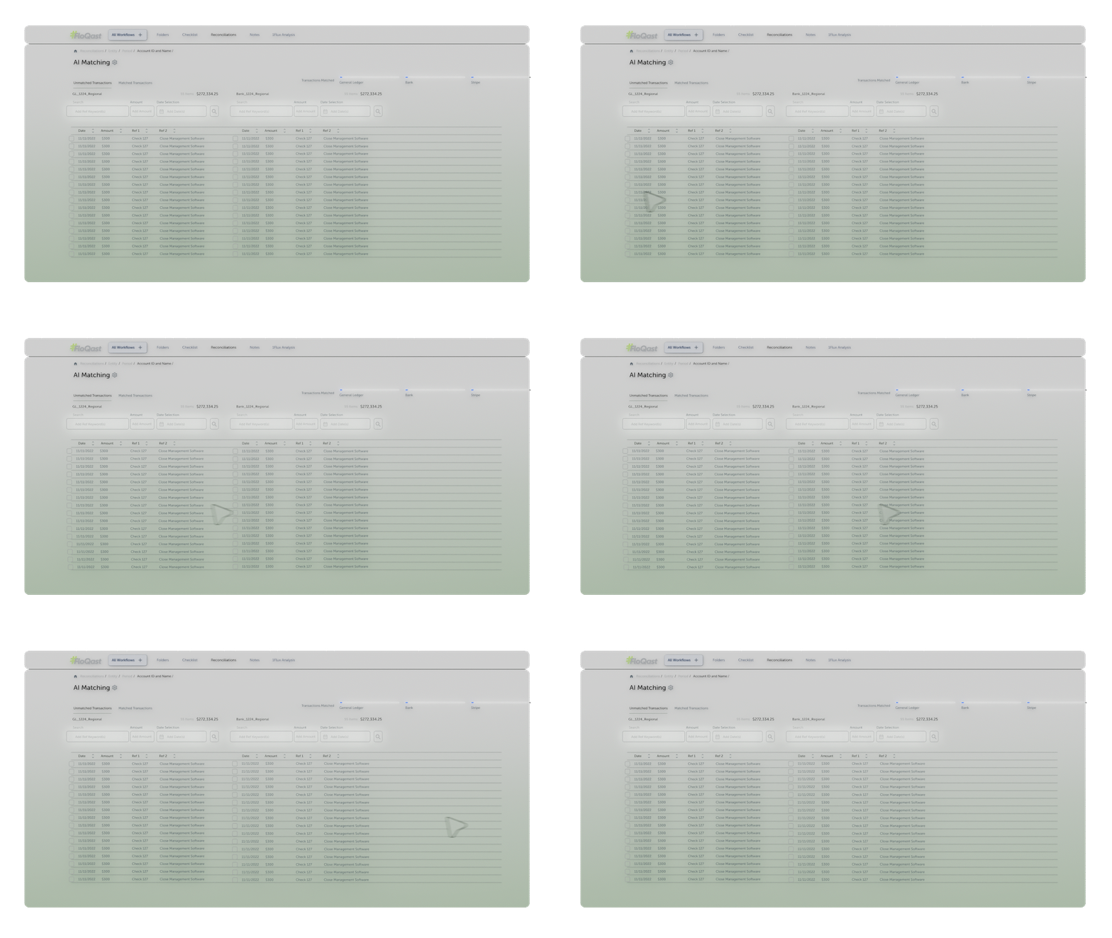
We took FloQast’s UX designs and broke them out into fully 3D systems, giving us control over animating every element. This allowed us to call out specific elements in a sequence that made the information digestible.
design
challenges
I understandable ux
Showing off a complex interface in a short teaser video, we had to figure out how to condense alot of information into something digestible. We took their account matching workflow and broke it down into 4 main steps, giving people the high-level idea of what it’s doing without getting lost in non-essential elements of the UX.
II kinetic typography
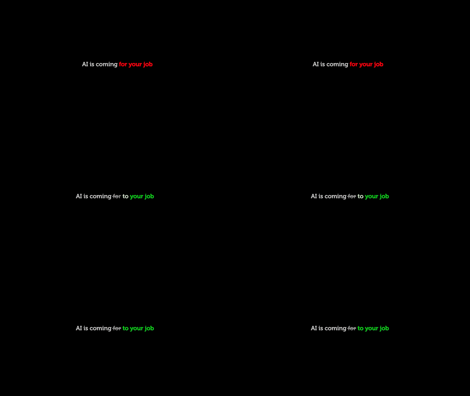
From the get-go, music & typography were huge pillars of the assignment. Locking the track selection was key so that we could time every keyframe to beats of the music. We debated back and forth on the exact phrasing used for each sentence so we could create a playful subversion of the audience’s expectations. We wanted to setup AI as a scary force coming from their jobs, only to reveal that FloQast’s AI products are their friend.
III scene settings
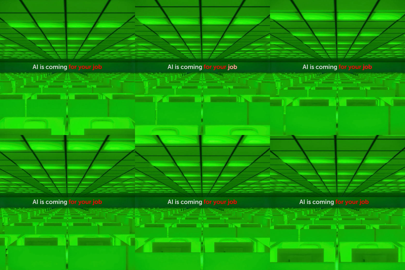
Originally the entire video was supposed to be typography but we ended up blowing it out to create something that felt premium. The interface became fully 3D, and the intro section became an opportunity to show a workplace where people feel happy. Originally the idea was to show cubicles getting deleted one by one, but the idea of accountants working in cubicles felt dated. It was argued that if the workplace looks miserable, maybe people wouldn’t mind if AI took their jobs. So instead we painted a rosier picture of an open, modern office so that the idea of losing your job felt like a bad thing.
visual
design
Heres how the visual story developed. Here’s some of the designs that we created to show off these processes.
social
campaign
kick-off
client
testimonial
“I've shared it with the team and initial response is that they are blown away. Overall we are all completely sold on the creative elements and visual flair you added. you killed it dude, super thrilled with all the extra layers you added and the marketing team is blown away. we've been getting some amazing feedback and we're seeing incredible engagement on the AI video. Everyone loves the style upgrade and we saw immediate success with the LinkedIn post that went live yesterday. just wanted to say how great it was working with you and that I'm looking forward to doing it again soon.”
Joshua Glassman, Director of Marketing


